
Over the past few years, e-commerce has evolved substantially. No matter how big or small a business is, to earn more revenue, today, every company is making an online presence. This has changed the game between brands completely.
Having an online business doesn’t always mean having a great website.
To help the audience find a business, you need to have a logo. Logos are the brands’ most notable identity.
By simply looking at the logo, customers can recognize a brand easily. A well-designed logo can help businesses get launched at the stratosphere level while a wrong one can lead to failure.
Creating a logo that can get connected with the audience is not as easy as it seems. It requires careful planning.
If you are planning to start an ecommerce business, before designing a logo, it is better to get some inspiration from the top e-commerce brands.
have a look at top e-commerce brands with the best logo designs.
1. Amazon:

Amazon started its operations in 1994, and during that time, it was nothing but a small online bookstore. But today, it is a billion-dollar company that sells every product we can think of. The brand has not only won the hearts of the audience through their services but also their logo design.
The design of their logo is quite simple but communicates a lot about the company. The arrow starting from ‘A’ to ‘Z’ conveys that they sell everything a customer can possibly want.
Additionally, the arrow below the wordmark denotes the smile that the customers of the company would experience by shopping on their website. The black color in the design signifies dominance, while the orange color resonates with happiness and pride. The font used in the logo is similar to the Officina font style.
2. eBay:
When the company got launched, Pierre Omidyar, the founder, didn’t think much about having a symbol. He just wrote the name of a company in a plain black color text in Times New Roman font, which was perceived as the company logo. But actually, it was not a logo. When the founder realized the importance of a logo, he introduced a new logo with a different font and color palette.
If you compare the current logo with the previous one, the notable difference that you will see is that the letters are not overlapping.
The colors of all the letters are the same. Talking about the font, well in both versions, the designer has used the same font called Univers. The only difference is that the current font is thinner than the previous one.
3. Walmart:

Walmart is the largest global American department store chain that started its operations in 1950. From the starting, the name of the company has been the center point of their logo design. The company has undergone many transformations, and the current logo has been around us since 2008.
Unlike old logos, the current logo, except the letter ‘W’ features ‘Walmart’ in lowercase. The star symbol has been replaced with the sun icon, representing sparks of creativity and innovation that they and their employees embody.
Talking about the colors, well, the designer has used the soft blue and yellow scheme in the design that evokes a feeling of happiness and inspires hope.
The font that has been used in the design seems to be close to Myriad Pro. The current logo reflects the company’s new eco-friendly approach to run their business globally, and today it is one of the most recognizable symbols in the e-commerce industry.
4. Target:
Target is the second-largest retail store in the USA. The company started its operations in 1902. In 1989, the company removed the ‘Bullseye’ image from its logo. But in 2006, the iconic standalone bullseye again become a part of their logo design. In 2018, the company introduced its current logo.
The only difference between the current and previous logo (2004) is that the company name has been changed from uppercase to lowercase. The circle within the circle symbolizes totality and universalism.
The company’s logo stands out because of its bold red color and striking simplicity. Do you want to create a striking logo for your business too? Use an online logo maker tool. The tool lets users design professional logos within minutes.
5. Alibaba:
Alibaba is a Chinese multinational company that specializes in e-commerce, retail, Internet, and technology. The company started its operations in 1999. Since the beginning, its iconic emblem has been a part of their logo design. If you look closely into the emblem, you will find a smiling face, which is probably the face of ‘Alibaba’, and the letters ‘A’ and ‘L’.
This sets a perfect example of negative space. In the current logo, the name of the company has been placed just below the symbol.
The first part of the name has been written in bold while ‘.com’ is given a regular weight font. Universe (for Alibaba) and Pluto Sans (for .com) fonts have been used in the design.
6. Uber:
Uber is an American multinational company that offers ride-share and ride-hail. In 2018, the company introduced its new logo. In the old logo, the name of the brand was written on black background in capital letters. But in the current logo, by writing the letter ‘U’ in capital and the rest in small letters, the brand has represented itself to be friendlier.
The background and the color of the logo have been kept similar. Talking about the font, well, Uber Move san-serif font type has been used by the designer as the font is popular for moving signage worldwide.
7. Snapdeal:
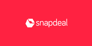
Snapdeal is one of India’s largest e-commerce companies. It was in 2016 when the company gave a second-time makeover to its logo. Earlier the company had a wordmark logotype, but with the rising competition, the brand rebranded itself with a new logo along with campaign called ‘Unbox Zindagi.’
The icon in the logo resembles an open box. The current logo has been designed by Design Studio – a firm that has also designed the logo of ‘Airbnb.’
8. Flipkart:
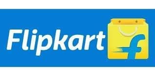
Flipkart is another top e-commerce company that started its operations as an online bookseller. Since the time of its inception, the company has introduced six logos. The current logo was introduced in 2015. The logo was conceptualized and designed by the Flipkart design team and an external agency called Umbrella Design.
The new identity aligns with Flipkart’s vision of commerce in India by re-establishing its focus on the mobile platform. As per the company, the 3D design and complementary colors in the logo help in breaking the mess and making the brand more attractive on mobile platforms.
The new logo design combines the elements of youthfulness and playfulness. The new design has also retained all the elements that represent the company’s legacy of being trustworthy, strong, and authentic.
9. Best Buy:

Best Buy is an American multinational consumer electronics retailer that was founded in 1966. Since the time of its inception, the company has undergone many logo changes. It was on May, 2018, when the company introduced its current logo. Aesthetically and technically, the current logo is much better than the previous ones.
In the current logo, the company name has been pulled out of the sales tag and the size of the sales tag has also been shrunk. The sales tag has been placed adjacent to the letter Y. The company has retained its bold font.
Only the color of the font has been changed from black to white. The simplicity of this logo and the famous sales tag makes it one of the best ecommerce logo designs.
10. Urban Ladder:
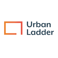
Urban Ladder initiated its operations in 2012, with a thought to make a million homes beautiful. The company logo sets a perfect example of minimalism. The logo features an incomplete square along with the company name. This incomplete square represents four walls of an empty room that requires good furniture to grow more beautiful. The orange color used in the logo signifies creativity and joy.
11. Port of Mokha:
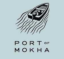
Port of Mokha is a famous brand that sells coffee from Yemen. Mokha is basically a port city on the Red Sea coast of Yemen. Just like the name, the company has a logo featuring a boat leaving from the coast. There is a trail of waves behind the boat. The brand name has been placed behind the boat. The logo also communicates the story of the owner, who left for Yemen to bring back its coffee for the world to taste.
12. Newegg:
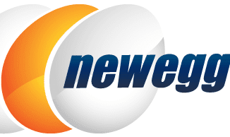
Newegg is a leading tech-focused e-retailer in the USA. The company has a global reach of more than 80 countries. The company started its operations in 2001. The founders of the company claim that the name as well as the company logo represents hope for new business in the world, which was earlier a struggle for the e-commerce businesses.
Just like the name, the company’s current logo features an image of three eggs, and the brand name has been written on top of one of the eggs. The color white and orange have been used in the design to denote perfection and success respectively.
Conclusion:
That’s all folks! These are the top e-commerce companies that have created great logo designs. We hope that this list has inspired you and will help you create a unique logo for your company. Which company logo has inspired you the most? Share with us in the comments section below.


